
Hotel Raleigh, Raleigh, N.C.
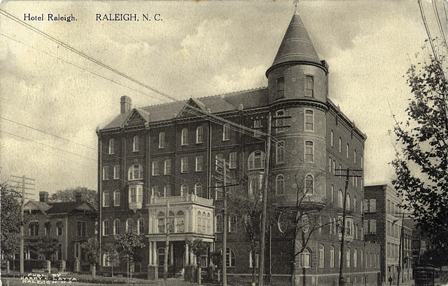
For Flashback Friday this week we feature three postcards from the first decade of the 20th century which depict Raleigh’s architecturally flamboyant, but, sadly, long-lost Hotel Raleigh.
Over the course of the past year and a half we’ve published several postcards in this series with curious messages written on them, but I must say, the one written on this card is a real puzzler.
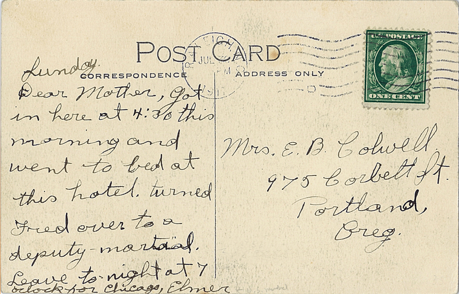
Sunday
Dear Mother, Got in here at 4:30 this morning and went to bed at this hotel. turned Fred over to a deputy martial [sic]. Leave to-night at 7 o’clock for Chicago. Elmer
Whoa — Elmer turned ‘Fred’ over to a deputy marshal, in Raleigh, and then headed out that evening for Chicago? Who was Fred? Elmer’s brother, maybe? And ‘Mother’ lives in Oregon? I wonder what’s going on here.
Our feature postcard this week was published by Harry C. Latta, and mailed in 1911. Latta was the chief clerk at the Hotel Raleigh, and probably commissioned this card to be sold to guests.
The postcard below offers an interior detail of the stylish hostelry — the second floor ‘sun parlor’.

The card was never mailed, but the message reveals an interesting commentary on the hotel’s furnishings.

These are very old pictures and furniture. Have overstuffed in lobby now. Looking thru sun parlor windows on Nash Square park.
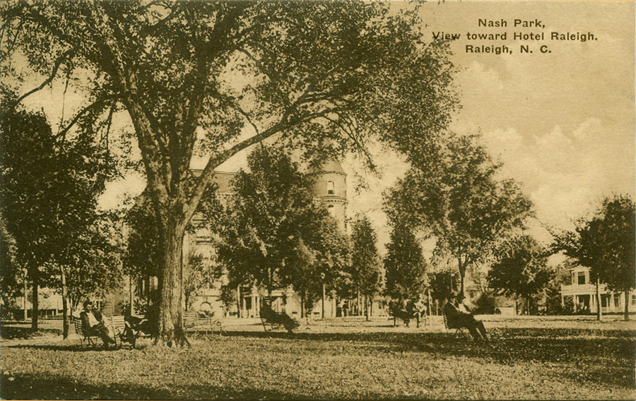
Below is a postcard view of Nash Square showing the hotel in its context of what was then a largely residential area of town. Sorry to say, there is no message written on the back.
You can read about the storied history of the Hotel Raleigh, aka Park Hotel, aka the Park Central, as detailed in a previous feature on Flashback Friday.
The last two postcards were published by the renowned Albertype Co. of Brooklyn, NY.
The Albertype Co.  1887-1952
205 (260) Adams Street, Brooklyn, NYThis important printing and publishing firm, founded by Adolph and Herman Wittmann, first started printing books under the Wittmann Brothers name in 1887. They went on to become a major publisher of national view-cards utilizing the albertype process. Adolph Wittmann was the photographer of many of these images.
Their postcards were not numbered and their name appears within the stamp box on their early cards. When the divided back postcard was authorized, the Albertype company created a line down the back of their cards with the words Post Cards of Quality. Many publishers, large and small, printed cards though the Albertype Co. They were purchased by Art Vue Post Card Company in 1952.
Many of their albertype cards were printed in black & white, but they also produced a tremendous number of hand colored cards. The style and quality of the way the watercolor paint was applied changed over the years but their RGB pallet remained consistent.
They also printed postcards in duotones and tinted monochromes of various colors. An early type was their Sepia Delft series printed in dark high contrast tones. This was followed years later by their Blue Tone cards that were similar to their lower contrast black and white albertypes except for their color.
“Flashback Friday†is a weekly feature of Goodnight, Raleigh! in which we showcase vintage postcards depicting our historic capital city. We hope you enjoy this week-end treat!
 Like us on Facebook
 Follow us on Twitter
 Subscribe to RSS feed
 Subscribe to posts by Email
 Sign up for the Newsletter
07/13/2012
It used to be more common for a husband to call his wife “Mother.†I suspect that’s the case with the writer of this postcard. A man named Elmer Barnes Colwell was appointed U.S. Marshal for the State of Oregon under President Taft. So it seems he may have been delivering Fred to Raleigh on official business.
Elmer Barnes Colwell was born in Harrisburg, PA on 11 Feb 1865. He married Eleanor Teed and they had one child. Colwell passed away in Portland, OR in June, 1914. Eleanor remained an active volunteer. In 1915, she and two others were appointed to Portland’s new motion picture Censor Board.
The postcard was mailed to the Queen Anne / Colonial Revival home they built around 1902. It was sold in 1919 for use as the Jewish Shelter Home. It served that purpose until 1937 and was listed in the National Register of Historic Places in 1984. It can be seen on this page: http://www.rootsweb.ancestry.com/~orjgs/sportland.htm
I’m not sure we’ll ever know who Fred was. (Sorry, hollywoodgirl – a real detective could probably figure it out!)
Sources:
http://records.ancestry.com/Elmer_Barnes_Colwell_records.ashx?pid=32418796
http://muse.jhu.edu/login?auth=0&type=summary&url=/journals/film_history/v022/22.2.erickson.pdf
http://www.jewishvirtuallibrary.org/jsource/US-Israel/jewshelterportland.html
07/13/2012
C’mon, Curt, use your Superpowers. There’s always another lunch hour.
07/18/2012
Curt — thanks for the fabulous research on ‘Elmer’. Every postcard tells a story, don’t it? Maybe Fred’s story will surface someday!
12/11/2019
So many interesting facts and crucial examples that
I’m astonished and highly satisfied with the data
you provide us. The issue is burning as well, therefore I suggest I will examine it two.